📖 Web Design Concepts
UI, UX, and Visual Design
- UI/UX
- User experience and interface design affect how a user interacts with a website. This includes visual design, usability, performance, clarity of content, and ease of navigation.
- Visual Design
- Refers to the look and feel of the site — logos, graphics, typography, color schemes, and layout.
Front-End and Back-End Development
Think of a website like a restaurant: the front-end is the dining room (menus, lighting, and customer experience), while the back-end is the kitchen and operations that make everything run smoothly.
- Front-End Development
- Client-side coding that defines what the user sees and interacts with, using HTML, CSS, and JavaScript.
- Back-End Development
- Server-side programming that handles data, authentication, and storage. Uses languages like PHP, Python, Node.js, and databases like MySQL.
Design Concepts Overview
Watch this short video to understand key design principles:
Design Principles
Web design combines visual aesthetics with strategic planning. These 10 Principles of Effective Web Design can guide your choices:
- Purpose
- What is the goal of your site? What will your users find or do?
- Communication
- Use scannable content with headings, subheadings, and readable fonts.
- Typefaces
- Choose fonts for clarity, readability, and tone.
- Colors
- Color sets a mood and reinforces branding. Make intentional choices.
- Images
- Visuals enhance meaning. Use images that support your content.
- Navigation
- Make it easy to explore your site. If users can’t find it, it doesn’t exist.
- Layout
- Plan the structure of your page to lead users naturally through the content.
- Design Patterns
- Use layout conventions that align with how users scan pages (e.g., F-pattern, Z-pattern).
- Load Time
- Optimize your site to load quickly, especially on mobile networks.
- Mobile Friendly
- Ensure your site works well on small screens and touch devices.
What Makes a Good Website?
- Clear purpose and consistent tone
- Logical navigation and structure
- Fast load times
- Responsive and mobile-friendly layout
- Accessible to all users
Explore Real-World Inspiration
Professional websites provide excellent examples of how design principles are applied in the real world. Browse a few of the sites below and choose one that inspires you. What is one visual strength you notice that supports the site's purpose?
My Web Training
An educational site created for web development students. It models clean semantic structure, clear typography, and practical, real-world content with responsive layout and accessibility in mind.

CSS-Tricks
A well-known web development site that combines practical tutorials with a clean, readable layout. The design features clear typography, thoughtful spacing, and accessible navigation that highlights both articles and community resources.

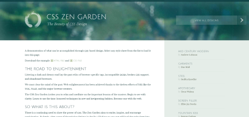
CSS Zen Garden
A classic site showcasing how CSS alone can transform the same HTML into dramatically different designs. It features clean markup, accessible content, and a wide variety of creative, standards-based styles from designers around the world.
Layout and Publishing Principles
Layout design uses visual strategies to guide user attention and create a consistent experience.
- Emphasis
- Draw attention using size, contrast, color, or placement.
- Balance and Alignment
- Use symmetry or asymmetry and grid-based alignment to create structure.
- Contrast
- Highlight important content using color, scale, or spacing.
- Repetition
- Reinforce brand identity by repeating fonts, colors, and layouts.
- Proportion
- Use size relationships to create visual hierarchy and organization.
- Movement
- Direct the viewer’s attention using visual flow, lines, or animation.
- Negative Space
- Let your content breathe. Space is a powerful tool for clarity.
Organizing Content
Semantic HTML improves accessibility and content clarity. Tags like <header>, <main>, <nav>, and <footer> help structure your page logically.
- Information Architecture
- Plan how content is grouped and accessed to improve usability.
- Content Strategy
- Develop content with purpose, consistency, and maintainability.
Steps to Build a Web Page
Step 1: Gather Your Content
Start with a plan. What text, images, or links do you want to include? What’s the goal of the page?
Step 2: Structure with HTML
Use semantic elements to describe your content. This makes your page easier to maintain and improves accessibility.
Step 3: Add Media and Links
Images, videos, and links bring your content to life. Use <img> and <a> tags appropriately.
Step 4: Style with CSS
CSS controls layout, color, and fonts. External stylesheets help keep code clean and reusable.
Step 5: Add Interactivity
Use JavaScript to create interaction — forms, buttons, and dynamic content.
Step 6: (Optional) Server-Side Features
Advanced websites use server-side programming to work with databases and user authentication. This isn’t covered in this course.
Summary
- Design is about clarity, usability, and user trust — not just aesthetics.
- Good layout, typography, and accessibility make a site more effective for all users.
- Semantic HTML and mobile-first thinking are essential modern practices.
Tools for Web Design
You can build web pages with any text editor, but using a modern IDE like Visual Studio Code makes development easier. VS Code offers cross-platform support, Git integration, and a rich ecosystem of extensions.
Browser Behavior
Browsers request content from a server and display files based on the directory structure. A slash (/) in a URL usually refers to a folder. If no filename is specified, the server will often load index.html.
- Different browsers may render styles differently.
- Follow HTML and CSS standards for the best results.
- Use semantic tags to improve clarity and accessibility.
- Design with mobile and accessibility in mind.
Designing for Mobile
- More than half of web traffic comes from mobile devices.
- Use responsive design and fluid layouts.
- Prioritize core content at the top of the screen.
- Design for different screen sizes and orientations.
Accessibility
Accessibility means making your website usable by everyone, including people with disabilities. It improves usability, mobile experience, and even search engine visibility. Accessible design is not just a technical standard — it’s a better experience for all users.
- Makes your content available to more users.
- Supports SEO and screen readers.
- Improves usability across all devices.
Accessibility Guidelines
- Use clean semantic HTML.
- Provide text alternatives for images and media.
- Allow text to resize and reflow.
- Don’t use images for text.
- Use form labels and table headers.
- Ensure strong color contrast and keyboard accessibility.
Check your pages using tools like WAVE Accessibility Tool or browser extensions to identify common issues and improve usability.
Last updated: June 24, 2025 at 12:17 AM