📖 The Box Model
Why the Box Model Matters
CSS treats all elements as if they were a box. Each box is made up of a content area that holds the text or images that appear on the page. Each box can also have padding, a border, and margins. Understanding this model helps you control layout and spacing precisely.
Box Dimensions
You can specify the size of a box on the page using the width and height properties. These may be specified in pixels, ems, or percentages.
content-box
By default, if the box-sizing property is not used, then the height and width properties apply only to the content box. This means padding and borders are added outside the specified dimensions.
aside {
  height: 100%;
  width: 300px;
  margin: 25px;
  padding: 25px;
  border: 2px navy solid;
}
In this example, the aside would take up 300 pixels for the content width plus 50 pixels of padding (25px left and right), plus 4 pixels of border (2px each side), plus 50 pixels of margin (25px each side), for a total of 404px.
aside { box-sizing: content-box; }border-box
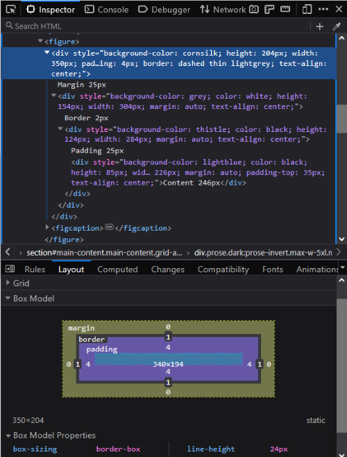
You can use the box-sizing property to apply height and width to the border box instead. This means the size includes the content, padding, and border.
aside {
  box-sizing: border-box;
  width: 300px;
  margin: 25px;
  padding: 25px;
  border: 2px navy solid;
}
In this example, the entire aside is 300 pixels wide. 4 pixels are for the border and 50 pixels for padding, leaving 246 pixels for the content. The margin is still outside the width, so the total width is 350 pixels.
aside { box-sizing: border-box; }Using Dev Tools to Understand the Box Model
Your browser applies default styles (called user agent styles) to elements like <p>, <h1>, and <ul>. These styles often include margins or padding that affect layout in ways you might not expect.
Open your browser’s Developer Tools (often F12 or Ctrl+Shift+I). In the Elements or Inspector panel, select an element on your page and look at the Layout or Box Model section. This shows a diagram of the content, padding, border, and margin areas — and their computed sizes. Adjust your CSS and watch the diagram update in real time.
Understanding how the box model adds up helps you solve common layout problems. For example, if two elements each have a width: 50%; but you also add padding and borders, the total width might exceed 100% and cause them to wrap or overflow. This is one reason many developers apply box-sizing: border-box; to make width calculations more predictable.
You can also override user agent styles to gain more control over your layout. Try inspecting default margins and paddings in Dev Tools, then override them in your CSS like this:
p, h1, ul {
  margin: 0;
  padding: 0;
}
Controlling Box Size
When sizing elements on a web page — especially images and content sections — it's important to choose techniques that balance design control with flexibility. The box model helps you think about not just the width of the content, but how padding, borders, and margins contribute to the total size. Below are common sizing strategies that build on each other.
1️⃣ Fixed Width
Setting a fixed width keeps the element the same size on all screen sizes. This can be useful for logos or items that must stay a specific width, but it can cause problems on small or large screens.
img {
  width: 300px;
}
2️⃣ Fluid Width with min-width and max-width
Using a percentage width allows the element to scale with its container. Adding min-width and max-width keeps it within reasonable limits, preventing it from becoming too small on mobile or too large on wide monitors. This is a common best practice for images in fluid layouts.
img {
  width: 100%;
  min-width: 150px;
  max-width: 600px;
}
3️⃣ Flexible Width with clamp()
The clamp() function combines minimum, ideal, and maximum widths in one rule. It helps you create a width that adjusts fluidly between the limits you set. This modern technique simplifies code and solves common sizing frustrations.
img {
  width: clamp(150px, 50%, 600px);
}
In this example, the image will never be smaller than 150px or larger than 600px. In between, it will aim for 50% of its container's width. This approach works well for images, cards, and other content areas that need to stay flexible but readable.
Tip: clamp() isn't just useful for controlling widths. You can also use it to size text, such as headings, so they grow and shrink smoothly with the viewport while staying readable. For example:
h1 {
  font-size: clamp(1.5rem, 4vw, 3rem);
}
This sets the heading to a size that adjusts with the screen size but stays between 1.5rem and 3rem. It helps create a responsive, balanced design without media queries.
Overflow
Be cautious using the height property as content larger than the space can be hidden. The overflow property controls how extra content is handled:
visible- Default. Content overflows the box.
hidden- Extra content is clipped and hidden.
scroll- Scrollbars appear even if not needed.
auto- Scrollbars appear as needed.
Padding and Margin
Padding is space between the content and border. Margin is space between the border and other elements. You can apply them uniformly or specify for each side:
main { padding: 20px; }main { margin: 0 5%; }main { padding: 0 50px 20px 10px; }Border
This example creates a solid navy border, 2 pixels thick, with rounded corners. You can adjust each part — color, style, width, and radius — to suit your design.
section {
  border: 2px solid navy;
  border-radius: 10px;
}border-color- Specifies the border color.
border-width- Sets thickness in pixels or keywords (thin, medium, thick).
border-style- Specifies style (solid, dotted, dashed, etc).
border-radius- Rounds corners. Supports shorthand and individual corner settings.
Box Shadow
Adds shadow to boxes. h-shadow and v-shadow required, blur and spread optional. Can use inset for inner shadow. Example adds a gray shadow offset 2px right, 2px down, with 5px blur.
box-shadow: 2px 2px 5px gray;When experimenting with box model styles, remember to validate your CSS using the W3C CSS Validator. Clean, valid code helps prevent unexpected layout issues.
Additional Resources
Last updated: June 22, 2025 at 9:51 PM